See what defines 2019 accom design
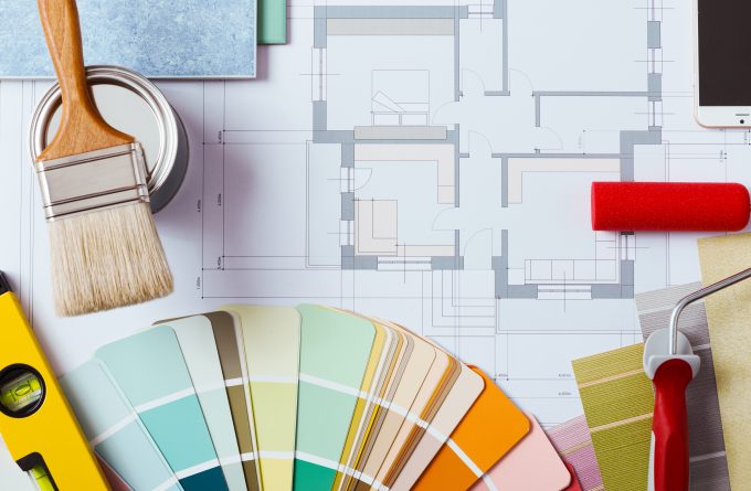
In 2019, accommodation design will be moving away from the popular neutral colour trend of the last several years and going toward bold and unique colour pairings with inspiration from nature to make hotels feel more like home.
This story was originally published by hotelnewsnow.com on 28 June 2018.
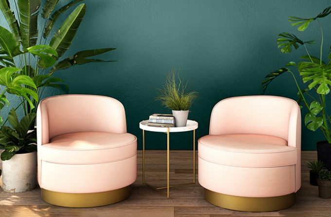
Lela Richardson, senior project designer at Wilson Associates, said using deep, dramatic colours in accommodation design has already been seen in the industry, and next year, this trend is expected to continue while pulling in dark greens, like PPG colour of the year for 2019, “Night Watch.”
“I actually really like dark green,” she said. “… There are a few ways I see it coming out: One is you have this really moody, dramatic opportunity to see it as an accent or throughout the whole space.
“As an accent, you see it gives a very powerful statement, but then throughout the space, especially in smaller spaces like restaurants or speakeasies, I can see it used holistically throughout the space—in the walls, in accents, in furniture, fixtures and equipment.”
The second way deeper colours like “Night Watch” can be used is as a backdrop in accommodation, Richardson said.
“You have this beautiful, dark colour that really does help colour in not just grey,” she said.
“And throwing a vibrant colour on top of that in contrast, that could be your surprise. As you walk into a space, that’s what draws you in.”
Christine Shanahan, director of design at HVS Design, said hotels are moving away from the knee-jerk reaction of neutralising everything and are going toward colour washing, which is where designers wash a room holistically in a colour.
“What I think we’re enjoying is a renaissance of colour again,” she said. “People not being afraid to be bold and be colourful, and we’re seeing the colour washing is where we see very, very interesting pairings of off colours, unexpected colours or unusual colour pairing, and they create such energy in the room.”
Shanahan said she sees the colour-washing trend starting in the guestroom and being paired with softer or contrasting colours to enhance deeper colours.
Eventually, it will move to public spaces where there is a feature or a focus, allowing colour to come into furnishings and single walls, she said.
Inspiration from nature
American paint company PPG’s choice of “Night Watch” as colour of the year was inspired by the growing popularity of house plants, and designers said accommodation can incorporate plants into public spaces like lobbies to liven them up a bit.
Shanahan said designers and hotels are reinventing in new ways, and this applies to colours and plants.
“I spent many years taking out planters; planters from the 1980s when there were big, big lobbies with massive planters,” she said.
When the massive planters were taken out, the lobbies felt less inviting, she said.
“If you’re anybody, you’re attempting to have a fiddly fig growing in your house or in your commercial space,” Shanahan said.
“So I think people wanted greenery back, people want the warmth of something natural, something alive, but we didn’t want it in that mass quantity that we had it years and years ago.
“So we’re using the plants to kind of punctuate and accent.”
Richardson added that she doesn’t see the houseplant trend coming into hotels, but she does see more natural elements coming in, such as living walls and hanging plants. These elements help create an inviting living space, she said.
Gail McCleese, practice area leader of hospitality at design firm Gensler, said living plant walls allow hotels to bring in nature without having an outside element exposed, as some hotels do with atrium features.
She added that wellness is not going away, which is why there’s been a push toward natural colours in hotels.
McCleese said PPG’s “Night Watch” could be used as a balancer throughout spaces in a hotel.
Other colours on trend
Dark greens might be seen on walls, in furnishings and in other parts of the hotel, but designers said other colours will be popular, but it depends on the location of the hotel. And while neutrals aren’t as predominant as they have been in recent years, they’ll still pop up in hotels.
“You might see gorgeous neutrals, really pretty warm or cool neutrals,” Richardson said. “Not always grey, not always brown, but really (soothing) colours in certain areas.”
Neutrals will make their appearance, but Richardson said hotels might also take a cue from the recent Milan Fashion Week, where “multicoloured everything” was seen in clothing.
“Done in a tailored way,” she said. “I think that’s where it’s going.
“It’s specific to the location of the hotel and it’s really opening up for designers to really use their imagination with colour.
“It’s about balance, but I don’t think there’s one specific colour that we can name for the next year just because I see everything coming into play.”
Danielle Hess writes for HotelNewsNow